Thursday, 27 April 2017
Monday, 24 April 2017
Question 3
What kind of media
institution might distribute your media product and why?
The institution I would let
publish Ghrime magazine is Bauer Media Group which is a large German publishing
company that operates in 15 countries including the UK. The main reason why I
have chosen this institution rather than Emap or IPC is because of the
magazines it already publishes for that include Q and KERRANG, that are very
successful in the music magazine industry. I believe my magazine is similar to
Q magazine as even though they are classed as men’s magazines lots of female
consumers read their magazine. As the grime industry it is very male dominated
and so even though my target audience is for both genders is does not stop
female consumers from reading Ghrime. Another, reason why I believe Bauer Media
Group is the best publisher for Ghrime is because it is a multi-media platform
so it can use radio for example to help promote my magazine to gain popularity
and receives a bigger brand identity. Too started with I want my magazine to be
published by print and online as that’s the platform which is growing the most.
Even though prints are decreasing in popularity because of online being even
more easy to access and being more convenient to consumers. When the brand
identity of Ghrime becomes a well-known magazine I will start an app which will
be a more convenient to consumers and will cost nothing but will have in app
advertising that will generate income to Ghrime.
Friday, 21 April 2017
Thursday, 20 April 2017
Friday, 7 April 2017
Double spread creation process
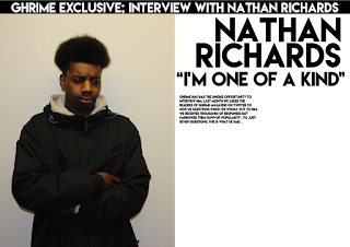
The first stage was importing my edited image on to sketch.
I then added a black banner to the top of the page which had the text "ghrime exclusive; interview with Nathan Richards" in the colour white.
For my third stage of development i added the artists name "Nathan Richards" and the pull quote from his story "i'm one of a kind". I positioned the masthead and the pull quote on three lines and looks like their is a slanted line where the lines begin.
From my research i wanted to include was some text that talked about what the page was about. So i positioned this, just under the pull quote on the left hand side of the page. I also used a bigger font size compared with the other text as i wanted it to stand out more, so that it'll be read before the main text.
I then added my main text which is put into two columns as it makes it look more professional and other music magazines like NME use this layout for their text.
When i put my main text onto the page i left some space where i could put my second pull quote. In this stage i added the pull quote of "i can't wait, i'm so excited" which then fills the remaining space on the page.
My last thing i wanted to add from my research on music magazines was page numbers. This followed the conventions of double page spreads because i placed my page numbers at the bottom left and right of the double page spread where their is no text around it, which then makes it stand out more for the reader.
When self reflecting on my double page spread i felt that the image let down the page. I then edited my image even more by reducing the hue saturation of the image as their was too much yellow in the image. This improved my double page spread alot because it now looks more brighter therefore making it more attractive for a reader to read the article.
Subscribe to:
Comments (Atom)


