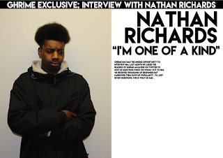
The first stage was importing my edited image on to sketch.
I then added a black banner to the top of the page which had the text "ghrime exclusive; interview with Nathan Richards" in the colour white.
For my third stage of development i added the artists name "Nathan Richards" and the pull quote from his story "i'm one of a kind". I positioned the masthead and the pull quote on three lines and looks like their is a slanted line where the lines begin.
From my research i wanted to include was some text that talked about what the page was about. So i positioned this, just under the pull quote on the left hand side of the page. I also used a bigger font size compared with the other text as i wanted it to stand out more, so that it'll be read before the main text.
I then added my main text which is put into two columns as it makes it look more professional and other music magazines like NME use this layout for their text.
When i put my main text onto the page i left some space where i could put my second pull quote. In this stage i added the pull quote of "i can't wait, i'm so excited" which then fills the remaining space on the page.
My last thing i wanted to add from my research on music magazines was page numbers. This followed the conventions of double page spreads because i placed my page numbers at the bottom left and right of the double page spread where their is no text around it, which then makes it stand out more for the reader.
When self reflecting on my double page spread i felt that the image let down the page. I then edited my image even more by reducing the hue saturation of the image as their was too much yellow in the image. This improved my double page spread alot because it now looks more brighter therefore making it more attractive for a reader to read the article.


No comments:
Post a Comment